
App: Money Manager

Challenge
Optimizing the App Money Manager in order to improve its usability and accessibility. Money Manager is an App, which lets users track, manage and plan their financial transactions.
Side Note: This projects purpose is to showcase my UX/UI Design skills. I do not work or have worked for Money Manager. The views presented are my own, and I do not have access to any user data or research that influenced the current design.
Company Background and Business Model
Money Manager, developed by the South Korean company Realbyte Inc, founded in 2012, has had 1.5 Mio App Downloads, according to their App Store pages.
The free version of the App contains ad placements in the standard banner format positioned at the bottom. The paid version (5,99€ one-time payment) removes the ads and gives the additional option to access it via Desktop.
User Research Learnings
My learnings from User Interviews are that the transaction input needs to be fast and easy, especially when entering more than one transaction at a time.
The current balance needs to be prominently in the viewport to make it easy to check if it matches the one in the banking app.
There has to be a prominent search option to locate transactions with accessible editing options.
User Stories

Structure and User Flows
Currently the primary destinations are Transactions, Adding a new Transaction and Reports. Secondary destinations are Accounts, Budgets, Search, Settings and Adding a new Account, Budget or Category.
Challenges and Goals
Improving the accessibility, especially with user input forms and lists
De-cluttering pages by removing or hiding functionalities
Designing a list view with clear information hierarchy and structure
Providing clear CTA’s
Re-organizing content and structure
Providing additional information that the users expect to find
Main Screen: Transactions
Main Screen: New Transaction
Main Screen: Reports
New Screen: Budgets
Updated Dark UI

UI Changes
Typography: I identified the current single-used font as Apple's SF Pro and re-worked the used styles based on the Human Interface Guidelines to increase readability and accessibility. I decided to keep SF Pro as the font due to its high legibility and clean branding.

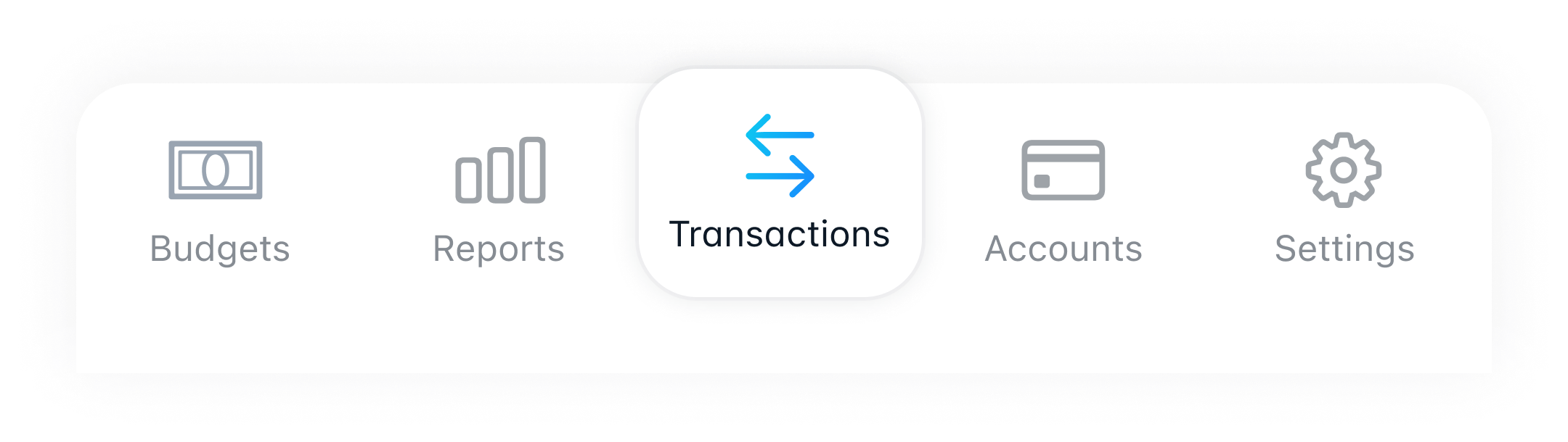
Icongraphy: To be consistent and convey the same brand, I use SF Symbols as the Icons. I switched a few symbols to make them easier to understand and added labels in the bottom navigation.
Colors: In the current App version, the colours are inconsistent. In some cases, color is the only indicator for states (list items), and text contrast is not high enough to ensure readability. The colors used are different variations of orange and blue.
I decided on blue as the primary UI color because it is more neutral properties, especially in finance. I updated the shade of blue to have a higher luminosity and saturation. I use a slight gradient for all colored strokes and coloured areas to highlight and emphasise actions and states.

Final Prototype
I developed a fully clickable prototype with my final design in Figma. It includes my learnings from validating critical user flows by Usability Testing and matches my goals with solutions for the challenges I identified.
Do you want to check it out? Let’s meet!